
Our small team spent one year brainstorming new journalism formats and testing prototypes with members of the BBC's least engaged audiences: Generation Z and women between the ages of 28 and 45.
We divided our work into three phases:
- Phase one, described in the previous article, was about designing story formats for younger audiences.
- Phase two aimed to design personalised story formats — stories that would adapt to the user — for women aged 28-45.
- Phase three aimed to make formats that would enhance the understanding of stories and issues, and we returned to Generation Z.
In this article I'll walk through some of our prototypes from the last two phases — both those that tested successfully and those that didn't. I'll also reflect on the project as a whole and what we've learnt over the year. Even when our experiments failed to address the news needs of our target demographic, we were able to better understand the ways in which traditional news reporting fails them. We hope our findings inspire others to challenge the way we all present and report stories online.
Personalised stories
The second phase of this project focused on developing story formats that were personalised or adapted to a user. This was challenging. Examples of personalised online stories are few and far between, even outside of news, so finding any kind of inspiration was hard. Most personalisation in online news is about changing the selection of stories for you to read, not changing the story itself. However "robo-journalism" (for want of a better term) aims to deliver many semi-automated stories efficiently, using data automatically templated into stories, and we felt like this might work well with personalisation. As mentioned we targeted another underserved BBC News audience in this phase — women from 28-45 years old — and we interviewed them in London and Leeds.
In the first design sprint of this phase our ideas focused on two aspects of personalisation:
- Location — serving local or social content personalised to the user's location, an obvious and realistic kind of personalisation.
- Adaptation — adapting a story based on a user's situation, context or their previous reading.
We didn't find much appetite for stories whose content had been deeply personalised and adapted, it seemed to diminish the idea of "canonical" news. And the people we spoke to didn't like being "put in a box" by personalised systems and said things like "...don't tailor news to me on things you think you know about me". In fact, about halfway through this phase we decided to stop calling it "personalising" as users associated this with online advertising or shopping. Instead we switched to using "adaptive" or "adapting" news to try to avoid these preconceptions.
We did find that giving people control over how a story is presented worked well. We also found that straightforward mainstream personalisation features were generally accepted, and people would happily trade their personal data (e.g. where you live or what you've read) for perceived benefits. But anything that was more personalised than this, or that didn't make it clear where the information had come from, met with more resistance. Having said that, when we tested a fictional prototype of a hyper-personal voice assistant for news which could answer your questions (which was actually one of us on the end of a phone call pretending to be a computer), it tested really well and delighted users who had quite low expectations of such systems.
Overall we are looking for formats that are feasible, desirable, meet user needs and are new and innovative. So as well as our regular user testing, we evaluated the prototypes ourselves against a range of criteria (see the previous post for how much more). Here are the three best performing prototypes that came out of this phase:
Hyperlocal
Would work for house price rises, pollution, inflation, school tables, jobless — I want to know how my area is doing
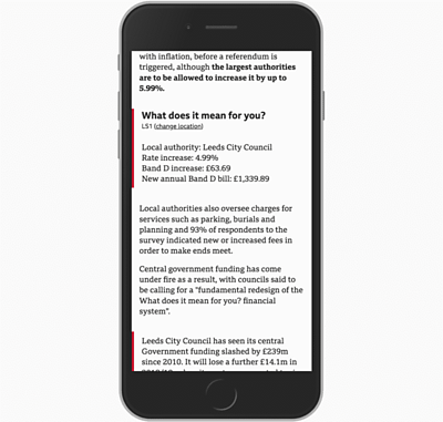
National news often lacks a local angle and we found that the women we spoke to wanted news they could relate to, something that speaks to them and shows what the news means for them. So, if we knew roughly where they lived, could we make national stories more relevant to people?
We tried multiple approaches, starting with giving users control over a story's geographical scope (either local or regional or national versions) before settling on interweaving personalised local information into a national article.
The Hyperlocal prototype shows a national news story (in this case about changing local taxes in the UK), and then inserts local information relevant to the user — from an estimate of how your council tax will increase to information about where you can meet your local councillors. This tested well; it was one of the favourites for the 28-45 year-old women we tested it with.
Given the necessary datasets it's reasonably practical to do these data inserts, and indeed, the BBC often makes "calculators" for this kind of thing. The local information is less easily automated, but could there be a role for local journalists in writing these sections for nationwide stories?
Summary
I'd want just bullet points of what has happened...to give me a summary
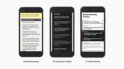
Not all news stories are standalone one-off articles. And many long-running stories are hard to get into or understand if you've missed parts of them. Could we automatically summarise previous articles so you can catch up quickly?
The design of the Summary prototype begins with a summary of the story so far at the top of an article. We tested two variants. The first was a paragraph summary written by a journalist, though potentially automatable in the future with good text summarisation technology. The second version used push alerts from previous articles in the storyline, presented as bullet points.
Both variants tested similarly, but we chose to develop the bulleted timeline as this makes efficient use of material we already produce in the newsroom. We personalised the timeline by indicating which stories in the storyline you had previously read. In testing, the overall summary was much appreciated but the personalisation wasn't so useful — participants quite rightly asked how we knew what they'd read, as they might have been following the story on other news outlets. In further iterations we refined the timeline without the personalised highlights and experimented with "fractal" expanding timelines that showed varying levels of detail.
Headlines
As a mum, with lots of distractions, this would really help me... I wish it was online now, I genuinely do like it
(This concept isn't really personalised and it's a bit out of scope, but we liked it and it tested so well that I've included it!)
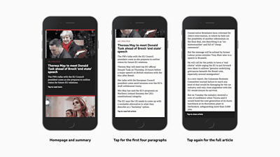
Skim-reading starts with headlines. Could we harness this in a prototype and address the skimming and digging behaviour that we'd seen in audiences? We experimented with prototypes that gave users the choice of varying story lengths with some success, but people didn't like stories being implicitly personalised with no active control. So what if articles started as headlines and then you could control how much you got?
The Headlines prototype presents a stream of stories as headlines with one-line summaries and large images. Tapping a story opens up a four-paragraph summary*; tapping again opens up the entire story and tapping a third time closes it. You can just scroll down to the next story at any point. This tested really well, people found it pretty intuitive to use and it fits their skimming behaviour. We also found that it makes finding stories you're interested in a lot easier — you just keep scrolling.
All BBC News online articles begin with a four-paragraph summary that outlines the whole story — a legacy of "multi-platform" authoring for online and Ceefax, an early digital text service delivered to televisions in the UK.
Understanding stories
For the third phase of the project we decided to look at how to help people understand the often complex and divisive issues in the news today, playing to the BBC's strengths in explaining complex stories and having an unbiased view. We decided to target the 18-26 year-old Generation Z audience again.
We'd refined our design and development process quite a lot by this point and you can read more about how we approached our final design sprint here. From all our prior user research we identified these particular aims for this phase:
- Try to give more context at the point that users need it. This is quite contrary to the traditional inverted pyramid of news in which journalists write what happened, then give more detail, and then more context.
- Aim to explain things better and answer obvious questions.
- Try to show the impact that a story might have on a user's own life.
- Try to show multiple perspectives on an issue or different angles on a story.
Again, here are the best performing prototypes we tested:
Simplify
That's exactly what I would want... those sentences that you kind of understand, you get a bit more background
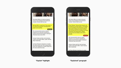
We knew that this audience prefers everything in one place, they told us that opening links can be distracting, and the experience of multiple pages or tabs on mobile is less than ideal. They also want extra information at the point of consumption. In the first phase of the project we developed Expander, which provides expanding inline definitions of potentially unfamiliar people and concepts. Simplify is a variation on this idea.
We wanted to develop something that provides alternative simplified versions of some paragraphs in a story to provide more context or background information. As you scroll through the story, some paragraphs are highlighted and an "Explain" button appears; tapping it swaps out the existing paragraph with one that provides a bit more context and explanation. As opposed to the Expander prototype, which contains additional contextual information, this is the same content but explained in more depth.
A majority of our participants appreciated the extra, more accessible information, and everyone said it helped their understanding of a story and it was very usable. But also, ever conscious of length and time, they liked that you could just expand the bits you needed.
Perspectives
If you have one person presenting the story, one viewpoint, it could bias the story — this makes it seem more real
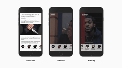
Our Perspectives prototype presents a selection of short video and audio clips — each from a different point of view — to address the audience's need for different viewpoints on a story. In a bar that appears at the bottom of a text article, thumbnail images of different sources appear. Tapping one opens up either a video or audio clip that gives a viewpoint on the subject of the article. In our example story we have a victim of knife crime, a gang member, a police chief, a DJ and others.
This was the favourite overall in our testing with Generation Z and it resulted in some great engagement. Some participants even continued using it after we had walked out of the testing lab. Everyone understood what it was and said that they found it made the story feel more objective and less biased than having a single journalist presenting it.
They also preferred it to linear video, liking the ability to choose which clip to consume. And surprisingly to us (because almost no-one we had spoken to in the course of the project used radio or podcasts for news), people seemed totally comfortable with listening to the audio clips.
We think it tested particularly well because of the familiar UX tropes it borrows from popular social media apps — circular avatars for each viewpoint and swiping through clips. And although it looks like it was a fair amount of work to create stories in this format, all the media we used was just clipped out from features on the BBC's News at Ten and Today programmes.
Consequences
Some articles can be biased, this gives you lots of things to consider before making your mind up
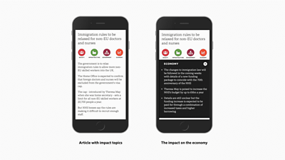
People told us that they cared about what a story means for them — but it's often hard to get this information from a news article. Consequences attempts to help you understand the impact of a story by breaking it out into different topics that you can choose from, such as economy, society, equality and *infrastructure. *Selecting one of these topics opens an overlay that explains the impact of the story on that category.
Consequences tested quite well, helping people quickly get an overview of a subject and giving them control over how they read it. However, people often didn't grasp that the topics described the potential impact of the story. We learned that we needed to be more clear about the purpose of the topics in the interface and the content.
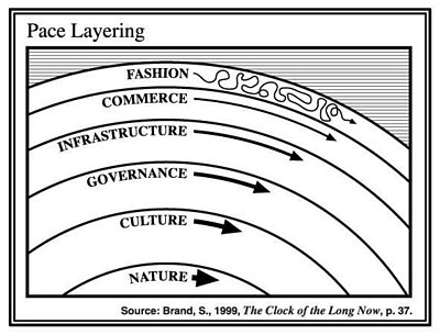
Note, this was originally inspired by *[the concept of pace layering from Stewart Brand](https://jods.mitpress.mit.edu/pub/issue3-brand)— illustrating how things in the world change on different timescales.*
What worked best
Throughout the process we were constantly testing our prototypes with our audience, but also listening to them talk about what they wanted from the news and how they consume it. About two-thirds of the work was done with Generation Z (18-26 year-olds) in the UK; the remainder was done with another underserved audience, women between 28 and 45, and a final validating test with an older "core" BBC audience. We found many of the needs mirrored across several audience segments — many people using mobiles, being short of time and having quite a fragmented experience of news. From this research we compiled a set of "truths" for our audience that we tried to design for in our prototypes.
- They use smartphones for online news (obviously), but they often have concerns about device storage (and so limited their number of apps) and using up their mobile data plans. So we always designed and built for the mobile web and focused on text and images.
- They do want news —and want to feel up-to-date and informed about the world and how events might affect them. They tend to skim the news, to quickly see what's going on, but then pick what's of interest to them and dig into that.
- They expect interactions and control in digital formats — with everything else they're swiping and tapping, so why not with news?
- There was a general preference for text for news — it's easier and quicker for most people. A small minority preferred video, and there are some stories where video is the best format.
- Opinions and different perspectives are important, particularly to the younger audience. They felt that seeing these helps them develop their own opinions and make their minds up on issues.
- The BBC (and many other news organisations) use too much assumed knowledge and jargon in stories. This can make the stories inaccessible to anyone who doesn't have the necessary context or background information.
Our best prototypes tried to meet these needs and solve these problems.
And what didn't work?
Many of our concepts and prototypes didn't test well at all, but they still helped us learn, narrow down the possibilities and choose the right direction.
For instance, one prototype showed you a brief story card for ten seconds, then moved onto the next story, showing six stories in sixty seconds — great for people short of time, we thought. People hated it. They felt pressured by the time limit and they wanted control —when they tried to tap and swipe, nothing happened!
Another delivered the background context to a story over several days in small chunks. We thought that for people short of time this might be a good way to learn. But it turned out that people just wanted all of the information now and asked us why we were withholding it.
Another gave readers the option to choose between two versions of a story: one for people new to the story, one for people already following it. But this caused a fear of missing out and several participants felt that they had to read both. This pushed us down the path of giving incremental choices in the prototypes.
One of my personal favourite ideas tried to harness the 5 Whys technique to try to show the root cause of a news story. But we couldn't get the interface and interaction design right and people didn't understand the concept.
Three scrolls is the right length
...is what one of our test participants said to us. And I think that points to some drawbacks with how we worked. Our focus on rapid iteration and user testing meant we didn't explore some deeper problems — like how people learn or better understand things — and we tended to optimise towards formats which make things "easy". Which is fine, but I think it means we tended towards simpler things that maybe hid some complexities of news and the world. Maybe for some stories we want to challenge people and make them think more?
Another artefact of the way we worked is that we tended towards incremental improvements on formats... so we were evolutionary rather than revolutionary. It was hard to escape from text and card-like mobile interfaces because they're so prevalent. And the audience is so used to common social media design patterns that these tested much better than our more unusual concepts.
We also tended to rate and compare a set of prototypes straight after testing, and maybe we threw away some badly performing prototypes too early. Possibly we should have concentrated more on learning things from each test, rather than on selecting which concepts to develop further.
It was also tricky prototyping with news stories! The stories tend to date quickly and everyone has their own interests, so sometimes the story presented in the prototype really affected the participant's response. If they're not interested in North Korea then your new format is going to struggle to appeal, however good it is. And we just didn't have time to write new stories every day or tailor the stories to each participant we were testing with.
Lessons
I'd just like to wrap up with my key lessons from the project.
- Assemble a multi-disciplinary team
- Test prototypes, but also test the writing and journalism
- Make many formats, not just one
- Develop reusable and structured content
- Show diverse opinions and explain things better
Having a full time embedded journalist was indispensable. She was not just writing stories but thinking about the users and the journalism and coming up with new format ideas. Similarly the designer made our ideas intuitive and usable and the developer was able to rapidly transform any idea into a prototype. The combination of all our skills also contributed to a greater whole.
Testing things was essential, otherwise we were just throwing out random ideas based on hunches. I lost several of my pet ideas through testing. But we were also testing the journalism. And we wonder if there's more of a role for user testing of the way we write our stories, regardless of the design and technology.
Our research throughout suggests that there is a need for multiple formats, even within the audience segments we chose. For every individual there are different needs from news at different times and places — from staying up-to-date, to learning about something new. So in taking this forward we will be thinking about how a collection of story formats could be used.
Many of these ideas are modular in design and most of the prototypes are quite structured. They reuse existing material, or create reusable content in an atomised/structured stories/object-based media kind of way. This means they could be cheaper and more efficient in the long run for anyone publishing large amounts of content.
Finally, the clear favourite prototypes were about explaining things better and showing the many different sides to stories. And I'm not sure you need new formats to do this better.
What's next
We're currently experimenting with some of the best formats by testing pilots on BBC News online — to see how they perform with users at scale, what it's like to produce editorial content for them and to get a feel of what stories they work best for.
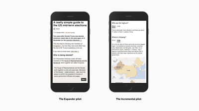
The BBC's Visual Journalism team have developed a version of Expander (developed in the first phase) that uses inline infoboxes to give definitions and context — like this explainer on the US mid-term elections. And we've worked with BBC News Labs to develop a version of the Incremental concept (also from the first phase), as seen in this article on the US mid-term election results.
I hope this series of prototypes and experiments have given you some new things to think about, and hopefully you will join us in challenging the status quo of news stories in digital news.
In the final post of the series, coming soon, my colleague Zoe will wrap-up what we learnt about underserved news audiences — Generation Z and women from 28-45.
BBC Research & Development team: Thomas Mould, UX Designer. Mathieu Triay, Creative Technologist. Zoe Murphy, Journalist. Johanna Kollman, User researcher. Tristan Ferne, Producer.
Also thanks to Alex, Akil and Cennydd for facilitating, Richard and Libby for helping with creativity, Allison for editing and Velvet, Dave and Rachel for testing things.
Latest news
Read all newsBBC News Labs
-

News
Insights into our latest projects and ways of working -

Projects
We explore how new tools and formats affect how news is found and reported -

About
About BBC News Labs and how you can get involved -

Follow us on X
Formerly known as Twitter


