


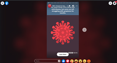
Our social media team took the text of a health story, tweaked the wording with the health editor and created a graphical version automatically.
This process and the subsequent prototype tool evolved over many months in Labs while we explored the possibility of making it easier to convert our website stories into a completely new, digestible format for our audience on Instagram and Facebook.
Reaching new audiences
BBC News is now the most popular news account on Instagram with over 15m followers. Our audience on the social platform is predominantly under-25. We wanted to see if we could reach this audience with content that isn’t jarring within their social feed whilst also fulfilling the BBC’s remit of informing and educating everyone.
The problem is that creating such content is typically extremely time consuming. In most cases our social and news teams either build bespoke experiences for our audience on social media using the news story from the website as a first draft, or write a short promo suitable for social and link to the news story.
We wanted to see if a prototype tool could use a level of automation to take the text story and give our hard pressed social and news journalists a first draft of such a bespoke experience - a graphical story inspired by comic animation.
Creative iteration
Over a year ago we started exploring this space, inspired by the research of cognitive scientist and comics theorist Neil Cohn and others who have dug deep into the essence of visual language and effective illustration for storytelling.
First time around we explored different ways to create multiple variations of stories from an image library so that the format wouldn’t become repetitive for readers.
The hypothesis we wanted to test was would this new format engage younger audiences. If it did, could we assemble lots of stories from a library of a defined size in lots of different ways to keep audiences coming back to these stories and completing them.
On the technical side the team tested entity extraction using existing libraries and decided on a service-based architecture. This allowed us to innovate iteratively - adding functionality on top of what we knew would be fundamental requirements in turning text into relevant images.
Before coronavirus
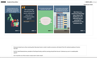
Over time, this tool began to wow our internal audience as it successfully detected quotes and percentages in stories and rendered different types of smartphone screen-sized panels based on the structure of a paragraph of text it was scanning.
The subject matter of health was decided on for this pilot because many of the stories that are covered on that desk are quite similar in structure, for example research findings and new treatments. A design agency Creative Control produced the library of images based on our analysis of entities that appear regularly in health stories.
Last year we tested a set of three health stories created using the first version of the prototype with a small audience focus group. The results were positive.
Then, we started to see stories about an unknown virus infecting people in Wuhan, China.
Journalists paint a picture
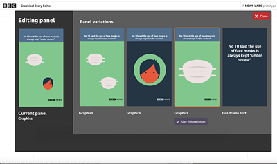
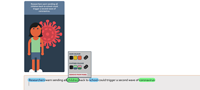
We didn’t just want our new format to be accessible for audiences. It was important that crafting these stories felt magical, with journalists’ words turning into meaningful graphics without any extra work on their part. This meant we needed to create an editor that let journalists focus on their words, while seeing in real time the graphical story that would follow.
We also knew that no automated system would get it right every single time, so we needed to offer some simple controls to improve any graphics that didn’t look quite right. The question was, how simple was simple enough?
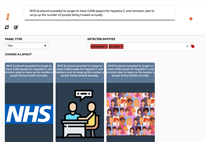
We iterated on the editor several times, experimenting with different ways of letting journalists control the end result. In our first prototype, we showed a list of key words we detected in the journalist’s text. This let them choose the relevant ones, and the type of panel that should be used.
It wasn’t the most intuitive approach. It forced our users to deal with conceptual abstractions that took them away from both the words they were writing, and the graphics that should result. It certainly didn’t feel magical.
We considered combining these controls with the text editor, letting the journalist tweak exactly which concepts should be represented by clicking on the words themselves. We added options so the journalist could tweak visual attributes like the colour of someone’s hair.
Combining the controls and the original text felt neat, but it was clear these controls were encouraging journalists to obsess with visual detail, and not the broad strokes. We’d gone too far!
We needed to go back to first principles, and really think through the problem from a journalist’s point of view. We worked through a series of ideation workshops with our brilliant UX Designer Ngan-Thi. After a process of restating and prioritising our user stories, it was clear that the biggest priority for our users was to create stories efficiently, and whatever we built needed to achieve that most of all.
Part of the visual furniture?
Now that our journalists have used the tool to publish a story, we are excited to see if it will be easy enough to use to become part of their regular working day.
We are exploring the idea of integrating the tool with the new content management system currently in development at the BBC and even publishing the stories in the BBC News mobile app.
And as for the iteration on the editor - that continues too. We are gathering feedback in the hope of prioritising necessary features and who knows maybe even experimenting with motion in our graphics.
We hope the tool can inform and educate during a trying public health crisis and make these important stories accessible and engaging for more of the population. The future looks animated.
Latest news
Read all newsBBC News Labs
-

News
Insights into our latest projects and ways of working -

Projects
We explore how new tools and formats affect how news is found and reported -

About
About BBC News Labs and how you can get involved -

Follow us on X
Formerly known as Twitter


